

iPhone Contemporary Interpretation

Contemporary Art History re-envisioning
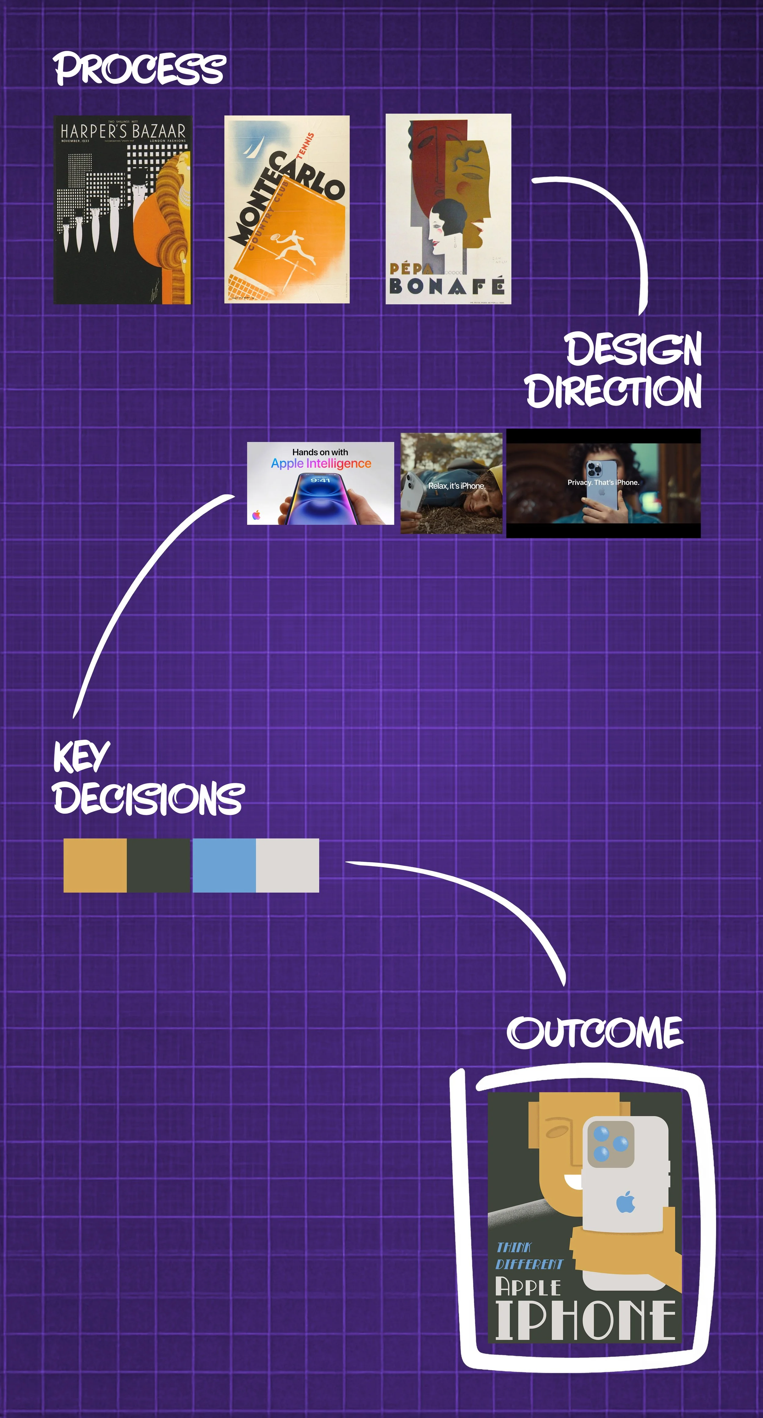
History of Graphic Design Class
Description
With this piece, I was tasked with reinterpreting a contemporary company’s style in the form of an older design art form.
Challenge
Invoke all of the design elements that are present in the Art Deco style of art advertisement, while also adhering to the iconography that Apple, as a company, is known for promoting within its product line.
Taking inspiration from the Art Deco movement of the 1920s and 30s, the poster was conceptually designed with the thought of leaning more into mimicry and recreation. Imploring the use of similar textures, colors, and framing devices from the time, wherever possible, was essential in maintaining that authentic feeling.
Homogenized through History

Solution
Keeping the color palette and overall structure to a minimal degree allows the composition to have a predominant focal point, the face and the phone, showcasing the prospect of advancement and progress that each style is known for.
3
See Full Image
Sealed with Authenticity
The final variation of the design chosen had many elements depicting the greatest sense of nuance and simplicity while still focusing on the Apple brand first and foremost, which is ultimately what led to its selection and subsequent refinement.

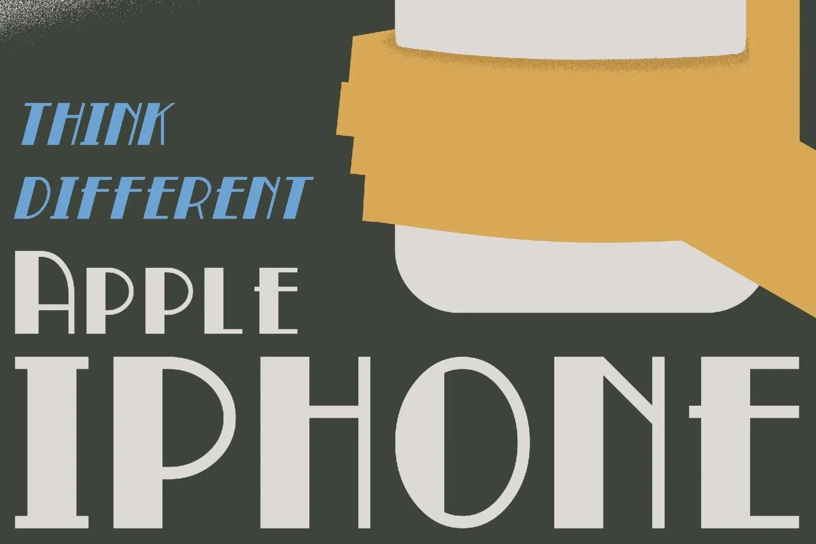

Camera over the eye acts as a replacement design
Tagline and headline highlight different aspects of the product through the colors
gradient on the shoulder to separate the negative edge and simulate faded plastic texture

1
2