
Mtn Dew Energy Advertisement Campaign
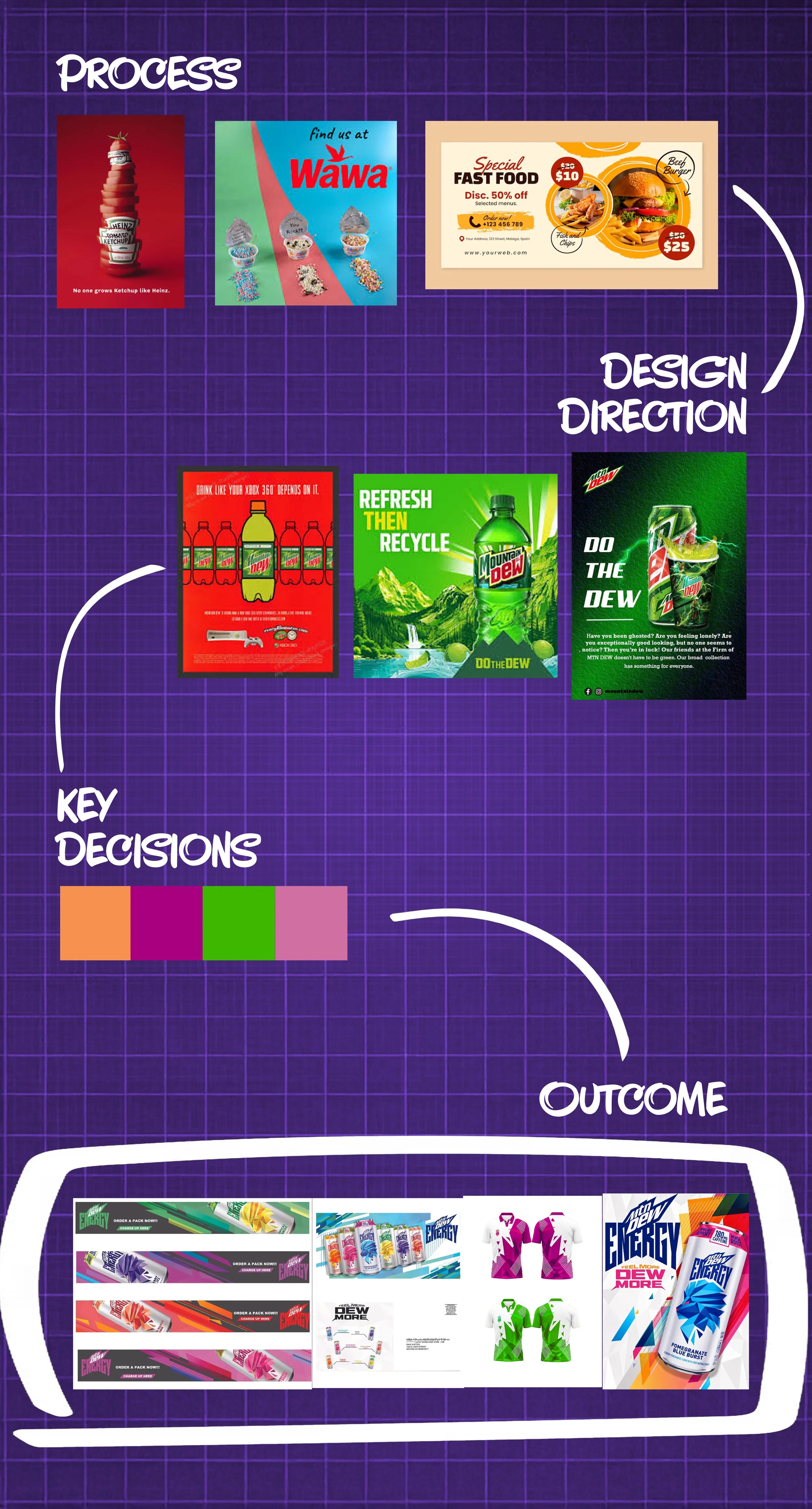
Conceptualization of linear product distribution variants
Advertising design class
Description
For this piece, I was tasked with creating a line of variable marketing advertisements for a company, that company being Mtn Dew.
Challenge
Construct a lively and energetic array of concepts that not only could be realistically unified in branding, but also different in execution from how the company usually publicizes its work.
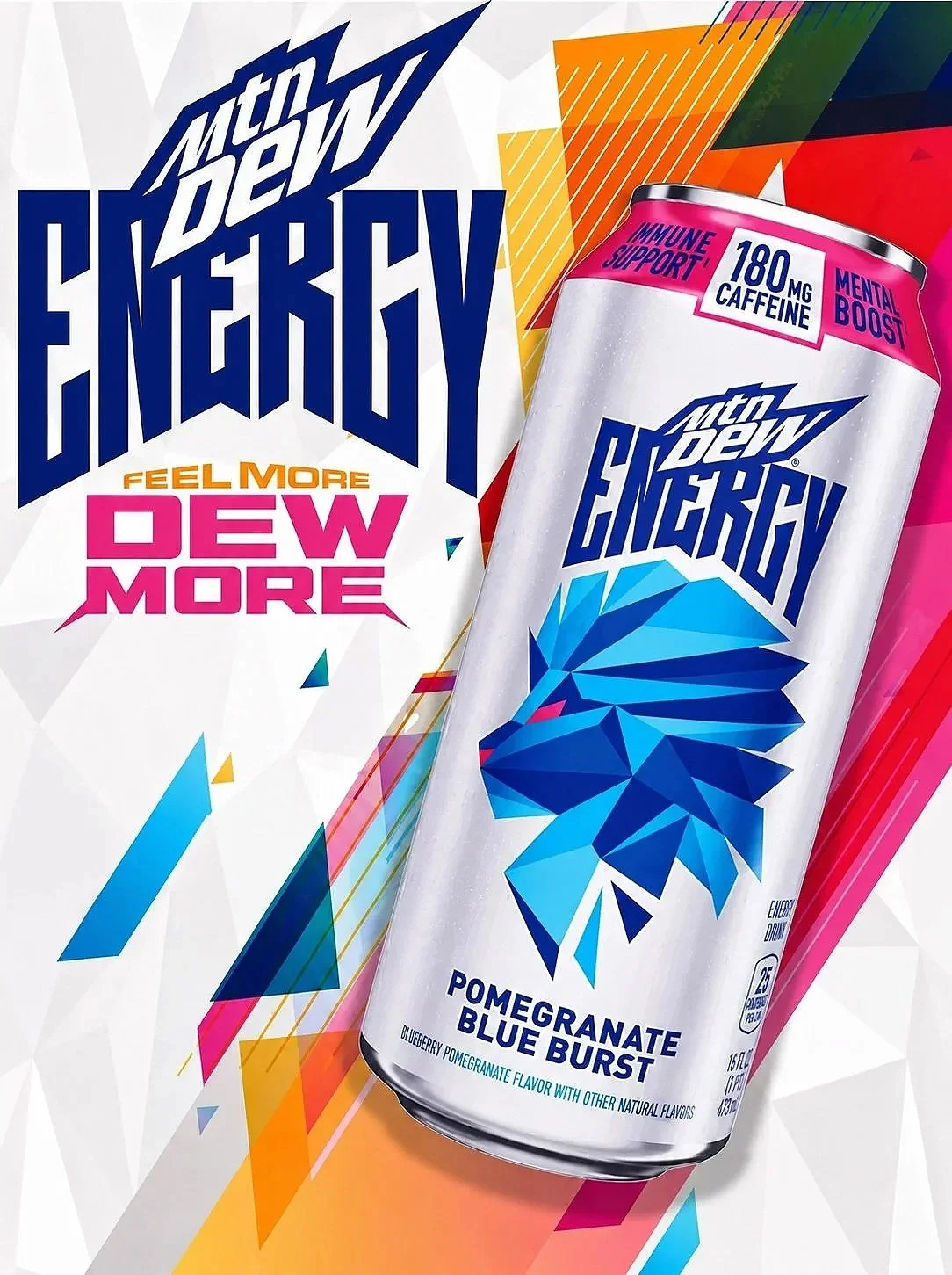
Mtn Dew’s company brand is instantly recognizable and energetic due in part to its longevity on the market, and transferring that essence and trust in a non-alienating way was a crucial thought throughout the redesign process. Focusing on the logo's sharper, glass-like aesthetic was a common point of interest.
Deconstructing the Dew

Solution
Using the geometric shard look that is present on the main logo, the variants are aligned in such a way as to complement the angle that their advertisement will be viewed from, with bright colors and jagged edges to invoke an element of style and energy.
See Full Image
Energy Around Every Corner
The final variation of the design chosen had many elements depicting a strong feeling of energy and range of motion that entices the viewer at a glance, which is ultimately what led to its selection and subsequent refinement.

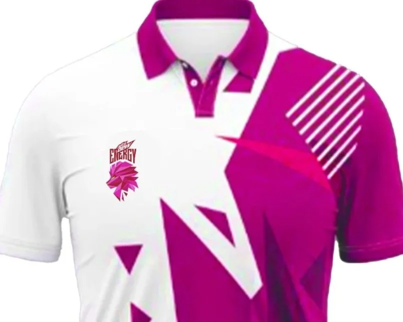
Geometric edges for consistency with both the logo and product line
Geometry gets angled differently based on the design’s intended aspect ratio
Styles mostly pointing towards the logo or drink


1
2
3
